here's nearly a year of website history, lovingly compiled because im the type of person to keep rehashing my stuff, and i don't like forgetting how things were. of course, the very early days of my website weren't archived, but you can probably imagine how it looked back then.
version one
this design lasted the longest, it was the first design i came up with that i liked, and it also happens to be the first design that i backed up in its entirety. it's pretty, but also pretty minimal, which is why i ended up wanting a change of pace. it also had a lot of little inconsistencies in how html files were formatted, some tabs were ignored, the use of iframes all on one website limited its flexibility, the font was just a little bit questionable, etc. of course up until pretty recently i still used that font, but i still think it deserves being called out. honestly, despite its imperfections, it still has a lot of charm to me and i'll always remember it as the first time i could settle and be proud of a website. oh god, the amount of tutorials i looked up (mostly w3 let's just be honest here) to make this layout was insane. i didn't touch css for a while after making this theme, until i needed to make a website for a shortfilm i was a part of (i'm not going to show you haha).
version two
alright, so, version two was the first ground-up rewrite i did for this website. i pretty much scrapped every page (except for the blogs of course, those i only edited to fit my new html conventions) to make it work how i wanted, and it was the shortest lasting one. as of writing this, i literally just heavily modified it in exchange for better colors and whatnot. this theme was super super minimal, almost too minimal for my taste, almost too boring. of course i would never have such a thing on this blessed website, but it was close. my favorite part about this layout is definitely the navbar, it's so simple yet it's all you realistically should want from a navbar. the font did persist from the last layout, partially (okay maybe completely) because i couldn't be bothered with switching fonts to a more readable one that fit the website's new aesthetic and appeal.
version three
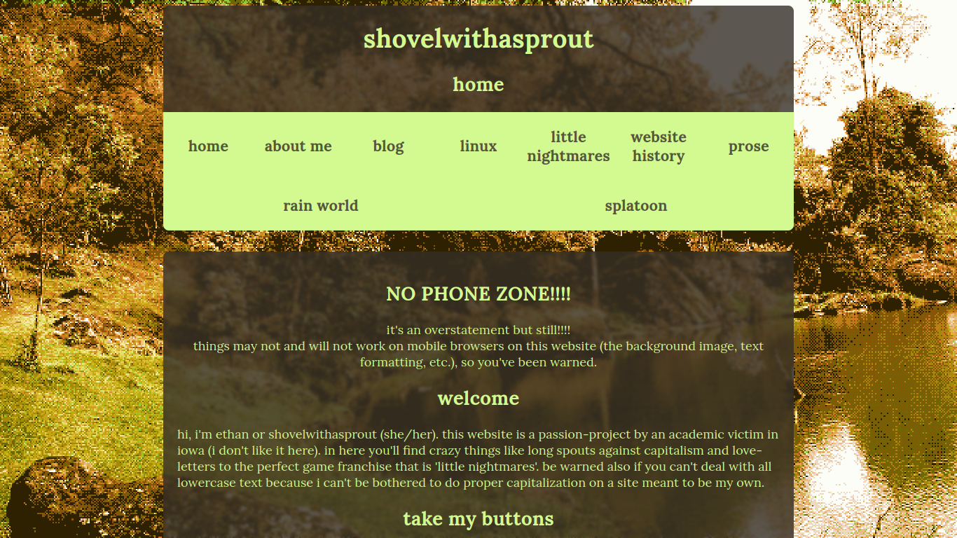
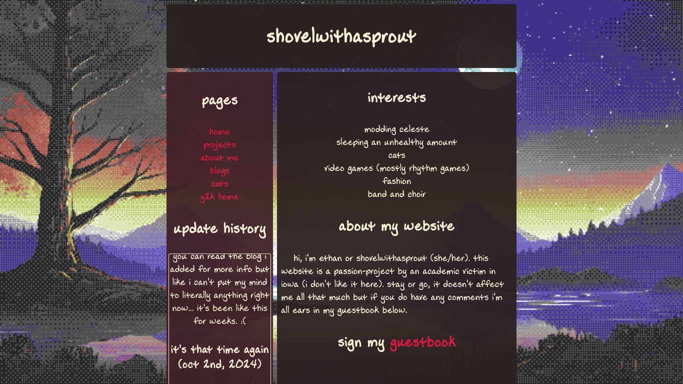
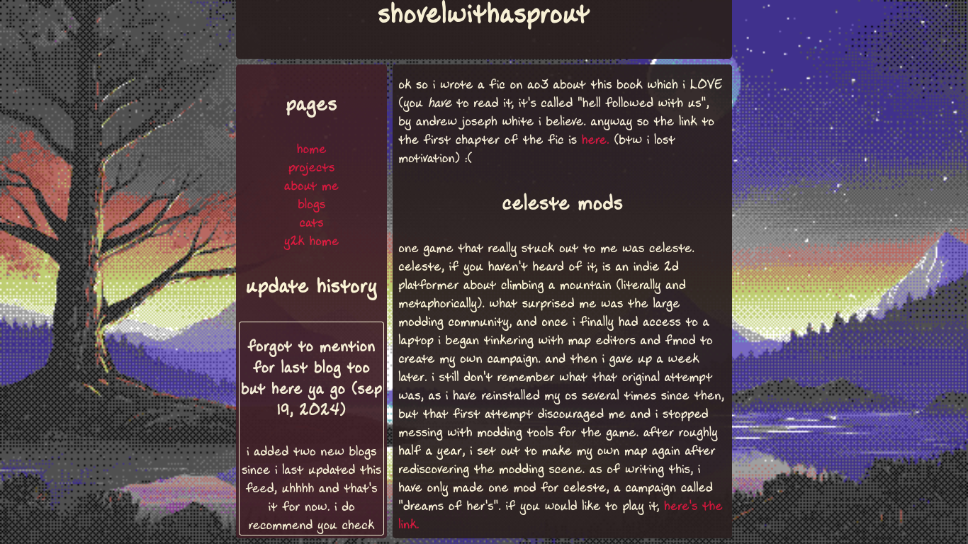
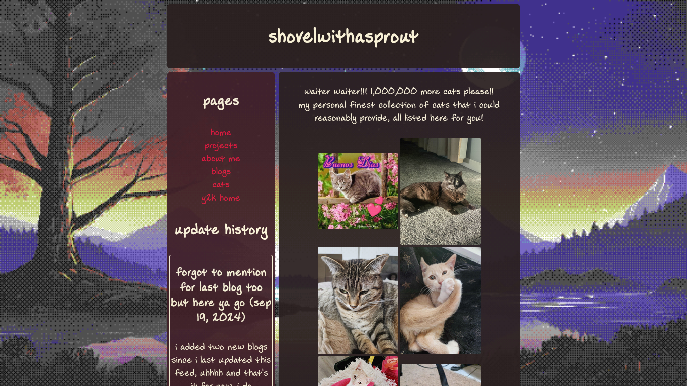
version 3 is pretty similar to its predecessor, but with the feature that each page now had its own color scheme. i didn't see many sites doing that so i thought it was a nifty little idea to incorporate into my graphics. additionally, i tried to change the overall mood of my site by changing the background to those from omori, going back to a normal font, and implementing the frosted glass look the proper way. this design lasted for quite a while in my eyes, and was overhauled later mostly due to the rigidity of my html structure.
version four
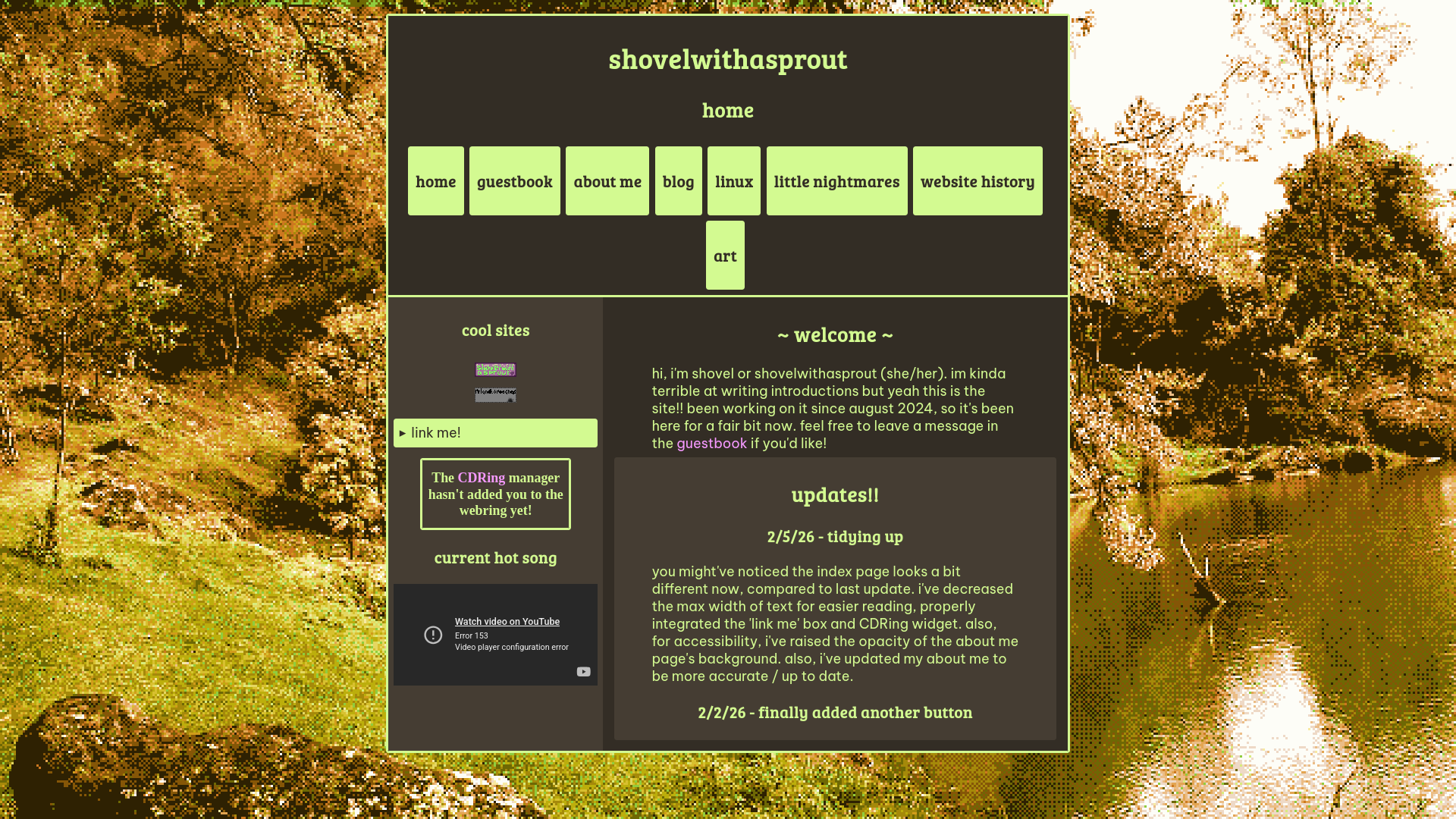
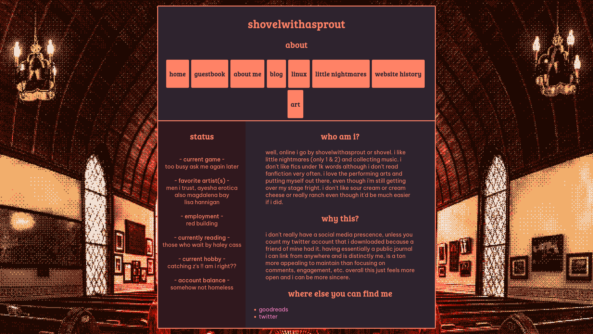
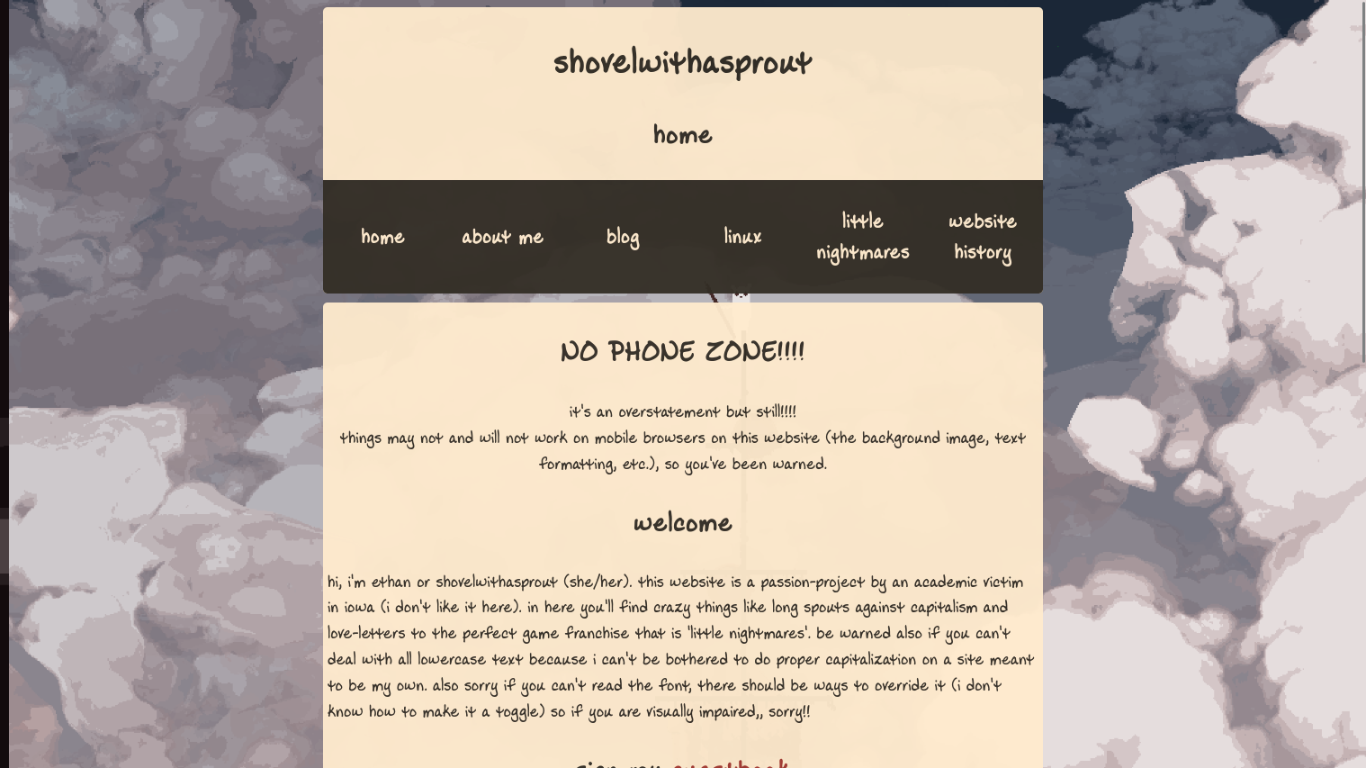
looking back, my web design wasn't the most friendly for those with visual impairments. also they erred on the side of being really visually noisy. with version 4 my goal was to simplify everything so that all elements were a) more accessible and b) more orderly. this could include things like standardizing theming across all pages (no more special cases for each page), increased flexibility for alternative layouts (adding a sidebar when wanted, space on sides of text for images, etc.), and just a general refresh because i like innovating on my website. since taking these screenshots, there've already been some minor changes that you can definitely pick out from the little portion showcased.
there was no need for an overhaul of mood, so i didn't fidget around with the backgrounds at all. however, i did switch fonts again to a sans-serif font, for a cleaner look matching the new design language.